Company / Client name
- The EGC Group
- Big Fuel
- Naviscent
- Fanlime
- LBi
- Moment Design
- Wiley
- Solvate
- RAPP
- AnyClip
- Critical Mass
- Weight Watchers International
- USAA – UI Architect
The EGC Group
November 2011 – August 2012
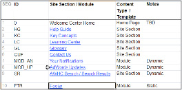
EGC brought me on as the Experience Lead on a project for their client, Brother International. The goal of this project was to create a new unified homepage template for Brother that would tie together branding and experience across all of their sites (a portfolio which includes 46 countries across 6 continents).
It was my responsibility to define a project that would utilize user experience expertise to create the optimal user interface. Thus, I was in charge of conducting discovery activities (including competitive analysis, qualitative and quantitative research, persona definition, high level content audit), definition activities (including scoping, estimates and planning), design activities (including information architecture definition, user interface information design, oversight on visual design, styleguide and build definition documentation), and validation activities (including selecting a third party resource to run unmoderated user testing for 60+ participants across all 6 continents, and working with the third party resource to analyze and present validation findings). In the end, Brother ended up with a homepage template that not only had a world class design, but whose usability and durability had been validated with users across the world. Below is the final presentation that I put together and presented to the Brother International Team.
Brother International New Homepage Template presentation:
Big Fuel
Februrary 2012 – July 2012
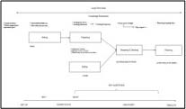
In the Winter of 2012, Big Fuel asked me to join their Social Media Brand Architecture team in order to continue defining, and start visualizing, the Social Media Brand Architecture for Samsung. The goal was to define a true social media brand architecture that would help meld together Samsung’s global and local conversations across their properties throughout the world. On this project, it was my responsibility to not only help define further the architecture and social media strategy that was already built, but also to create interfaces that would showcase the architecture in use.
Below is a draft presentation to Samsung:
Samsung Social Media Brand Architecture presentation (Draft):
Naviscent
July 2011 – March 2012
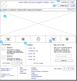
Naviscent approached me looking to redesign their dotcom site in order to make it appeal more to both potential clients as well as potential employees. I was responsible for putting together the IA estimates conducting stakeholder interviews, conducting competitive analysis, creating wireframes for the interface and overall QA for creative and development. Below is the finished specification that was delivered to the team:
Naviscent Site Redesign wireframes:
On a different project, NBC was looking to revamp their internal screening software to be more streamlined and up to date with current standards. They hired Naviscent for a short pre-project effort to determine a conceptually roadmap for further work. I was responsible for leading the effort and partnered with a lead visual designer to conduct stakeholder interviews, create conceptual interfaces and create and push forward the digital roadmap. Below is the final deck that was presented to the NBC team.
NBC Digital Screening Room Admin Tool report:
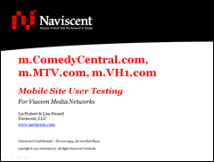
On an earlier project, Naviscent was hired by Viacom Media Networks to test the usability and appeal of their top mobile websites including: m.comedycentral.com, m.mtv.com and m.vh1.com. A test including 10 participants for each brand was conducted over a week long period. I partnered with the other lead research to create the test plan, facilitate the tests as well as write and present the findings to Viacom. Below is the findings deck that was presented to the Viacom team.
Viacom Media Network’s mobile usability findings report:
Fanlime
October 2011
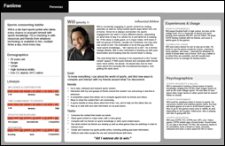
Fanlime was looking for guidance on which way to grow their new found product. In order to produce a well formulated, user, business and technology focused product roadmap, I conducted indepth user interviews, facilitated and conducted analysis, created personas, created a holistic and prioritized feature set as well as created the final product road map deliverable. I was the only user experience resource on the project, and was responsible for not only all strategy and UX work, but also for project management of the effort. Below are the personas as well as the final product roadmap that I created.
Fanlime Personas & Product Roadmap:
Lbi
June 2011 – July 2011
LBi brought me onto their UX team to help with their Google Ad Words project. Partnering with their in-house Lead UX Designer, I was the UX Designer responsible for reorganizing and redefining the site structure for the new Google AdWords Support site. Below is the output of the 800+ link site reorganization that I completed.
Google AdWords Help Center Site Structure
Moment Design
June 2010 – March 2011
In September of 2010, I rejoined the team at Moment to design a high profile iPad application that has yet to be released. The iPad project ran about 3 months after which I transferred onto the project to redesign espnw.com. The challenge in this redesign was to create popularity around an entirely new sector of an already popular brand, as well as to create a site whose design allowed the small team of web editors to manage and update it. I was responsible for opinions on usability testing, the entire interaction and ux design as well as input on visual design. Below is the final specification that was handed off to the web editor and build teams.
In June of 2010, the talented team at Moment Design brought me on to continue work on the redesign of nba.com. Previously they had redesigned both the nba.com homepage and video page. My role was to extend their principles as well as add my own to the remainder of the site. Below are links to the site map I created to inform the client what pages would be wireframed as well as the specs for those pages.
espnW Specification:
nba.com Site Map & Specifications:
Wiley
June 2010
While at Wiley, my role was to help setup, facilitate, and report on user testing for the Dummies.com website. Below is the report that I wrote based off observations from the testing.
Dummies.com Usability Report:
Solvate
April 2010
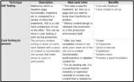
This project that I did for Solvate involved creating a matrix of different user research/user testing methods based on project type, budget, and available resources. The matrix below was the finished product.
User Research/User Testing Methods Matrix:
RAPP
February 2010 – April 2010
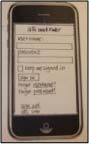
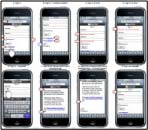
In the 2 months I spent with RAPP I worked on a Mobile Web Application that provides users with 3 random snack choices based on their reason for snacking, as well as designs for the new alli community and lastly questions and concepts for a premium fridge quiz which helps users understand their current eating and cooking habits. Artifacts that I’ve included here are a paper protoype run through and wireframes for the snack finder mobile web app as well as the concept flow for the Fridge quiz.
Snack Finder Paper Prototype & Wireframes:
Fridge Quiz Concept Flow:
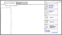
AnyClip
January 2010 – January 2010
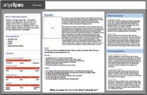
Included from AnyClip are conceptual sketches as well as personas based off preliminary user & business research that was done in order to investigate both the user and business point of view of anyclip.com. My role was to guide the in house designer through the research and deliverable creation.
AnyClip Concept Sketches & Personas:
Critical Mass
April 2009 – December 2009
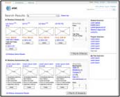
The work done with Critical Mass was for their Fortune 100 client AT&T. This work includes a project that showcased a collaborative effort to introduce future thinking around AT&T’s site wide search results page. The search solution includes a heavy focus on information design including introducing focused information sets as well as a tagging schema to site content. I was brought on this effort to continue and extend the thoughts of a fellow colleague as well as to present this work to the client.
Also from the Critical Mass / AT&T work is the Checkout flow for bundling & purchasing multiple products on att.com at once. As the agency side Information Archtiect, I was responsible for creating all wireframe deliverables shown as well as leading client reviews for these documents.
AT&T Site Search Future Thinking Wireframes:
Bundles – Checkout wireframes:
Weight Watchers International
June 2008 – March 2009
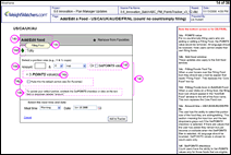
The Weight Watchers section includes innovation work which involved updating the Weight Watchers weight loss program online in a way that was clear to users. The solution consists of updates to Weight Watchers’ entire Rich Internet Application the Plan Manager. Although this was my first project at Weight Watchers, I was still able to serve as the subject matter expert on the Plan Manager application.
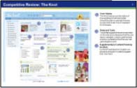
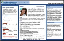
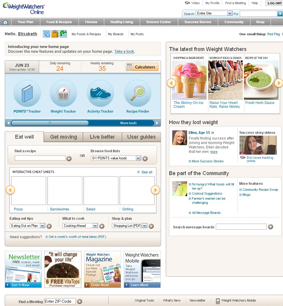
Other work at Weight Watchers involves making the site navigation more consistent so that the user knows where to find information, services and tools easily, thus decreasing their memory load as well as giving the user a sense of orientation. Shown here are competitive analyses, user personas and a production screenshot for they updated Weight Watchers homepage.
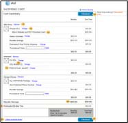
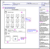
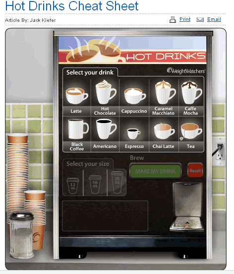
On the Awareness end, this section includes wireframes and comps for a flash application that was created in order to inform, in a fun and engaging way, Weight Watchers users the amount of their daily intake they were putting towards hot drinks such as lattes and coffees. As the IA on the flash application effort I worked with team members to create and document how the flash application would work as well as gave feedback on the designs that were presented from the wireframes.
Weight Watchers Innovation Wireframes & Comps:

Competitive analysis, User personas and Production screen created for updated Weight Watchers homepage:
Hot Drinks Flash App Wireframes & Comp:
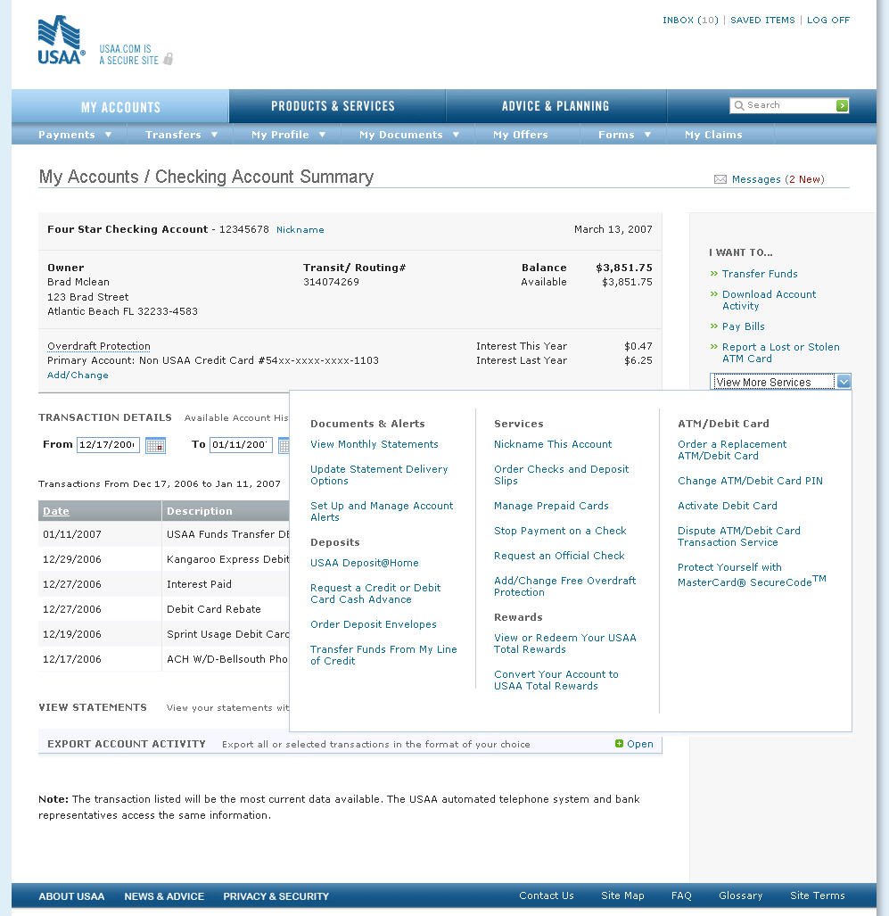
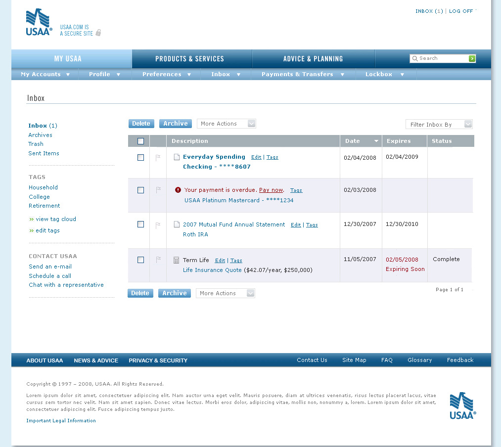
USAA – UI Architect
July 2007 – May 2008
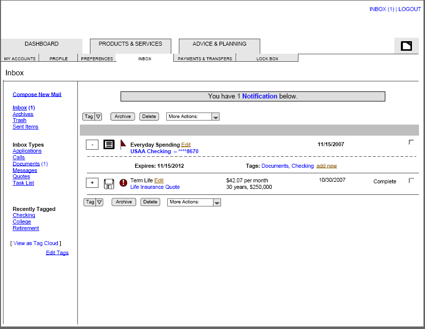
During my time at USAA as an UI Architect I worked on several strategies. These strategies include an update to the site IA with a focus on servicing accounts online, a portlet solution to support servicing accounts online 18 – 24 months out, and a combined inbox to support the many different communications from USAA to the user. These ideas had not yet penetrated the financial services realm and thus were very exciting, yet challenging to work on because there were not yet answers out there to the questions that arose. I was either the sole client side lead or client side co-lead on these efforts and most of them required heavy collaboration with our third party user experience team.
Combined Inbox Wireframes & Finished Comps:
Servicing Navigation Wireframes & Comps: