I love being a consultant because I love the freedom to choose my work, the freedom to choose when I work, and the overall ability to meet and work with so many different teams. Given all of these positives, there are still downsides to consulting. One big downside is that I don’t always get to see my work come to life because I’m not inside the company helping to push the work through. However, with Light & Motion, a client that I worked with last year on their site redesign, I was able to see my work come to life! The team pushed through and, two weeks ago, released the new version of lightandmotion.com. Of course, the design and photography are beautifully done, but the reason that this is the Most Beautiful project (or at least in the top 3 projects) I’ve ever worked on is not due, in my point of view, to either of these characteristics. The beauty, dear reader, is in the way the information is architected. Allow me to explain.
The Problems With the Old Site
“I feel like you should be wearing a cape or some sort of super hero outfit. The title Information Architect makes me think you are here to save the day.” Those were the words of my client when we met for the first time in the airport in Monterey California. I had flown across the country to help Light & Motion to redesign their site, and, as you can see, they needed help pretty badly.
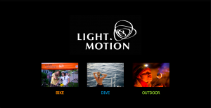
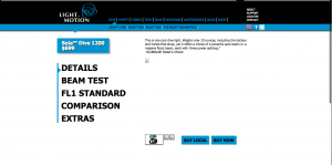
Besides the look of the site being dated, there were some other major issues they were facing. First the navigation, and the way information was organized on the site made it hard for users to find what they were looking for. Second, and perhaps more important, was that the way the site was setup did not properly reflect Light & Motion’s core mantras, nor did it allow them to properly showcase the extent that their product could be used. Instead it segregated products into Dive, Bike, and Outdoor. These categories gave users very little idea of all that the L&M lights could accomplish. Third, customers usually were segregated into one of the three categories, however, L&M wanted to bring customers across the categories to see the power of the products. This just wasn’t possible given the old site setup. Lastly, the site’s product pages, and in fact the site in general, didn’t support the way users shop for lights. This meant that the site wasn’t suited to get users to purchase. This was a big ecommerce no no.
Architecting A Solution
The first decision that L&M made was to work with Craig Wilson through his BLUX process. Craig talked to many users, and, from his research, created for L&M (among many other items) a brand universe, a brand positioning document, and what he calls a Buyer’s Life cycle.
From there, Craig hired me to help come up with a concept of what the site should be, how it should be laid out, and what the features & functions would ultimately need to be to support the L&M vision.
From our meetings with the L&M team, I could tell right away that they were a different company. They were passionate about their products and their users. They had sketches everywhere of the lights and the accessories that their users would need to participate in the activities they loved. They had a 3D printer onsite so that they could test their concepts. They were invested in, and passionate about, their line of products in a way that I had never seen. They did 95% of their work onsite in Monterey (including creating and shipping the lights!). It is a special company indeed.
Thus, I took great care with this project. I took a good amount of time to use Craig’s (amazing) work and research to create the right concept model for the site (this defined the entities of the site at a high level and how they related to each other. i.e. Products, The Company, The Activity, etc). From that really abstract level, I started to narrow down into the details of what information needed to be on the site, and how that needed to be constructed to meet L&Ms goals. From what Craig put together, it was so easy for me to see that the site needed to be all inclusive. People do a LOT of research when buying these types of lights because for one they are not cheap, but also these users are centered around the activities they use the lights for. Biking to work, diving photography, mountain biking… these are life mantras for the people that L&M’s products service. They care a great deal about the activities, and thus the lights that go with the activities.
Therefore, I was able to discern that the ability to shop both by product line/name AND activity was a key component that was missing from the old site. Further, making sure that both the products and the activities were all inclusive, content and information wise, was hugely important. And, lastly, making sure that all of these connected back to L&M’s presence in the industry, and that their mantra and passion for lights shone (pun intended) through was a huge deal.
You can see from the product and activity pages on the new site, how these relationships play out. And the beautiful thing about the IA that was created (and executed to!) is that it’s seamless. A user can move from activity to light, from light to activity, from light to company information behind why they light was created, and more without leaving the site, getting lost on the site and definitely without getting bored!
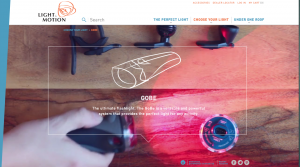
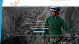
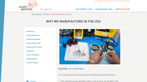
To bring it all together, L&M hired the Bkwld team to execute the design, and boy did they! Their work is not only beautiful BUT it’s, more importantly, designed for the IA. They did a magnificent job of taking the direction that the Information Architecture laid out in both information and concept, and creating a design that enhances that direction.
In Conclusion
After meetings and arguments and successes between all these parties, what L&M released two weeks ago is a thing of beauty for lighting purchasers across the world. It is a site that is delightful, informative, representative of the company, and indulgent of user needs. I’m extremely proud of the work that everyone on the team has done (especially L&M for sticking with us and pushing the work through), and I look forward to hearing the successes that come from it!
By valuing Information Architecture, and not just the “little” IA of the navigation, but the “big” IA that helped to lay the foundation and structure for the site, I’m sure L&M will see huge lifts in not only their sales, but in the passionate and loyal customers that reflect the company itself.