Many of you may not know this, but I get anxiety walking into a restaurant. I mean, it’s nothing major or debilitating, but I will, for instance, almost never walk in first (those of you that have gone to a restaurant with me before, stop and think about it, have I ever not opened the door to let you in first instead of going in myself?). I think that the anxiety stems from several things. One, I’ve worked in restaurants for a good portion of my life and I know how hard it is, and I don’t want to do anything “wrong” to disrupt the server’s day or process. I just do not want to be the person that they are swearing about in the back for the rest of their shift. Yeah, I know, I’m WAY to sensitive about this, but knowing that I have these weird hang ups, I’m willing to bet that tons of other restaurant goers have hang ups of their own.
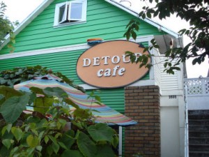
Anyway, the reason that I divulge this secret to you today is not just to get it off my chest (even though I do kinda feel better) but instead to talk about how a small cafe in Portland, Oregon put my anxieties and those of all their customers at ease. Detour Cafe was a spot that I visited in my time on the Oregon Beer Trail (to read more about my adventures visit www.wuzontap.com). I had been looking forward to going there for breakfast ever since my cousin and I planned our trip because they were featured in a food magazine and their breakfast sandwich looked amazing! (And it was amazing.) I was not, however, expecting to be hit with one of the best instances of user experience I’ve ever been through.

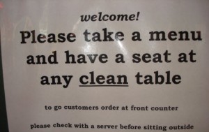
Upon entering the cafe, there is a sign… it is put squarely in your way and it reads “Welcome! Please take a menu and have a seat at any clean table.” Yes! Mystery 1 solved… I can seat myself and begin to look at the menu while I wait for my server. Perfect!
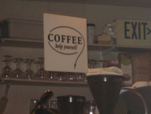
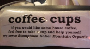
When our server came over he mentioned that if we wanted house coffee we could just help ourselves. Then he pointed us in the direction of this sign which reads “Coffee. Help yourself” with an arrow showing us where the coffee was. Woohoo another mystery solved. Better yet when going up to get your coffee there is this sign “Coffee cups. If you would like some house coffee, feel free to take a cup and help yourself. We serve Stumptown Holler Mountain Organic”. Perfect again! By now you are getting my point.
When I first started my career in UX and we were writing content for our designs, I always wondered why we didn’t just say what we needed to say in plain language. For instance “this page takes a long time to load because we are looking through thousands of customer records to find your’s. please be patient”. Obviously that was before AJAX and the like, but still… is it so wrong to just be completely honest? What I loved about Detour Cafe, was honesty was their brand. They put it on you to seat yourself and get your own coffee and walked you through how to do so WITHOUT human intervention. I was in UX heaven! Upon leaving I couldn’t help but reflect on how they had gotten it all right. From the content of the signs, to the placement, all the way down to the friendly font.
I would like to thank Detour Cafe, not only for the wonderful and nourishing breakfast, but proving to me that being upfront and honest about how things work does put a user (like myself) at ease and makes me want to visit again and again… one day I’ll be back!


